
ECOMMERCE
Native PDP Redesign
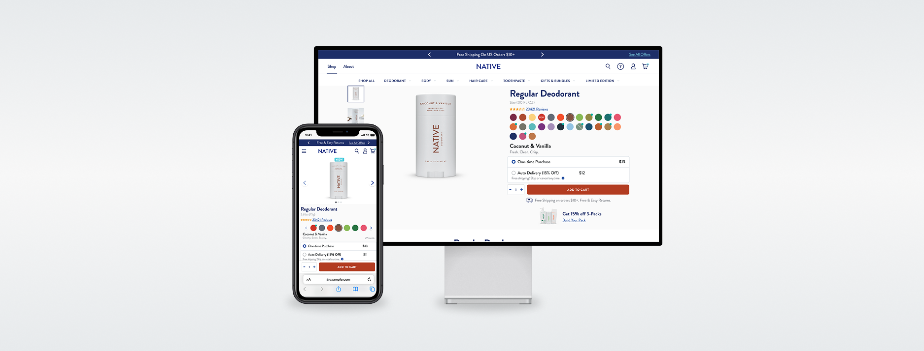
Redesigning the Path to Purchase
I was brought on as a UX Designer to help redesign the Product Detail Pages (PDPs) for a CPG brand’s most popular product: deodorants, body washes and hair care. These pages drove a significant portion of the site’s traffic and revenue, yet usability issues were creating friction in the purchase experience and impacting conversion rates. Before jumping into the UI, I focused on understanding why customers were struggling.
I conducted a full heuristic evaluation across the mobile and desktop PDPs, auditing the experience against Nielsen Norman Group heuristics and established usability guidelines. I paired this with website metrics and competitive analysis to identify where they can be resolved.
The Findings
Several themes emerged quickly. Critical purchase information was pushed below the fold, especially on mobile. The scent selector (one of the most important decision points) was clunky, poorly organized and difficult to use. Purchase options were fragmented, bundles were buried and cross-sell elements often competed with the primary call to action. UI inconsistencies made it unclear what was tappable while reviews and inline cart interactions reduced confidence at the moment of purchase.
Executing The Heuristic Findings
I prioritized findings using severity ratings and translated them into clear, actionable UX recommendations.
Key improvements included:
- Rebalancing the above-the-fold layout to surface price, scent, ratings and Add to Cart without additional scrolling
- Redesigning the scent selector into a mobile-friendly, organized experience with scent notes
- Grouping purchase options to support informed decisions
- Redefining cross-sell logic to focus on complementary products rather than distraction
- Standardized UI patterns for clarity and accessibility and improving reviews and inline cart interactions to reduce friction and error
The Outcome
The result was a scalable PDP framework grounded in usability best practices and real user behavior. While this phase focused on research and UX direction, the work enabled the team to prioritize high-impact fixes, move confidently into design and experimentation and set the foundation for for conversion optimization through A/B testing.
This project reinforced how thoughtful UX improvements, especially on high-traffic pages, can meaningfully improve both user confidence and business outcomes when design decisions are rooted in data, heuristics and clear prioritization.